Sales Analytics
See exactly how much you're selling. Crate's Sales report turns your completed orders into gross sales, order count, average order value and refunds — for any period, with side-by-side comparison.
Your Sales report is the honest answer to "how's business?". Every number on it comes straight from your completed orders — nothing is estimated, nothing is padded. Open it whenever you want to know what you actually sold over a stretch of time.
What each number means
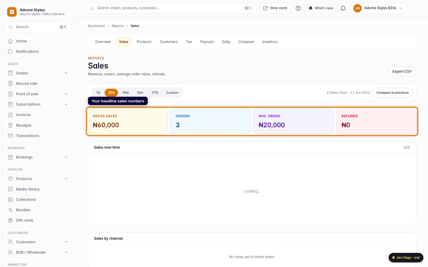
- Gross sales — total revenue from orders that reached the complete state in the period. This is money earned, before you net off refunds.
- Orders — how many orders you completed. Pair it with gross sales to understand whether revenue is coming from more orders or bigger ones.
- Avg. order — gross sales divided by orders, your average basket size. Watching this is the fastest way to tell if upsells and bundles are working.
- Refunds — the value of orders refunded in the period, so a strong gross number is never misleading.
Picking the right period
The period chips re-query everything on the page at once — the tiles and the chart — so switching from 30d to YTD is instant. Need an exact window, like a single campaign week? Choose Custom, set the from and to dates, and click Apply. Your selection is kept in the page's address, so you can bookmark a report or share the link and land on the same view.
Tip: The Avg. order tile is where pricing and bundling experiments show up first. If average order value rises while order count holds steady, your basket-building is paying off.
Comparing two stretches of time
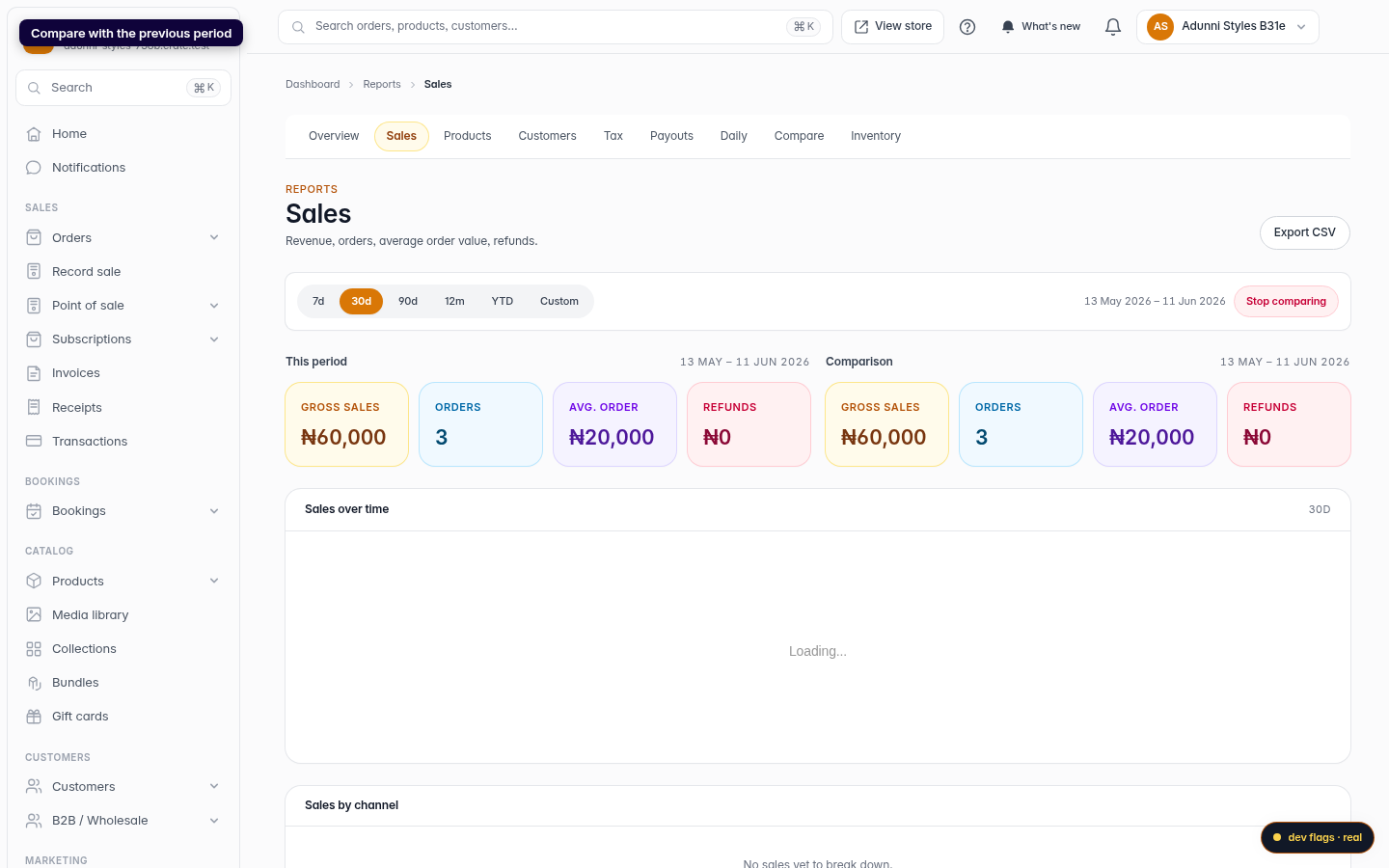
Toggle Compare to previous and Crate adds a second column for the period immediately before the one you're viewing — last 30 days versus the 30 days before that, for example. The two sit side by side so the trend is obvious without any mental arithmetic. Click Stop comparing to collapse back to a single column.
-
1
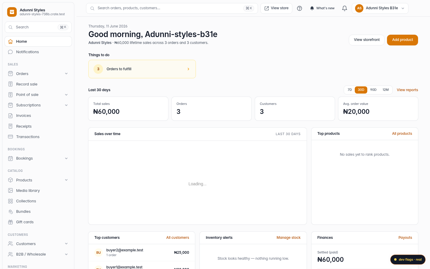
Open Reports
From your Crate dashboard, open Reports in the left sidebar. This is where every deep cut of your business lives — sales, products, customers and more.
Web -
2
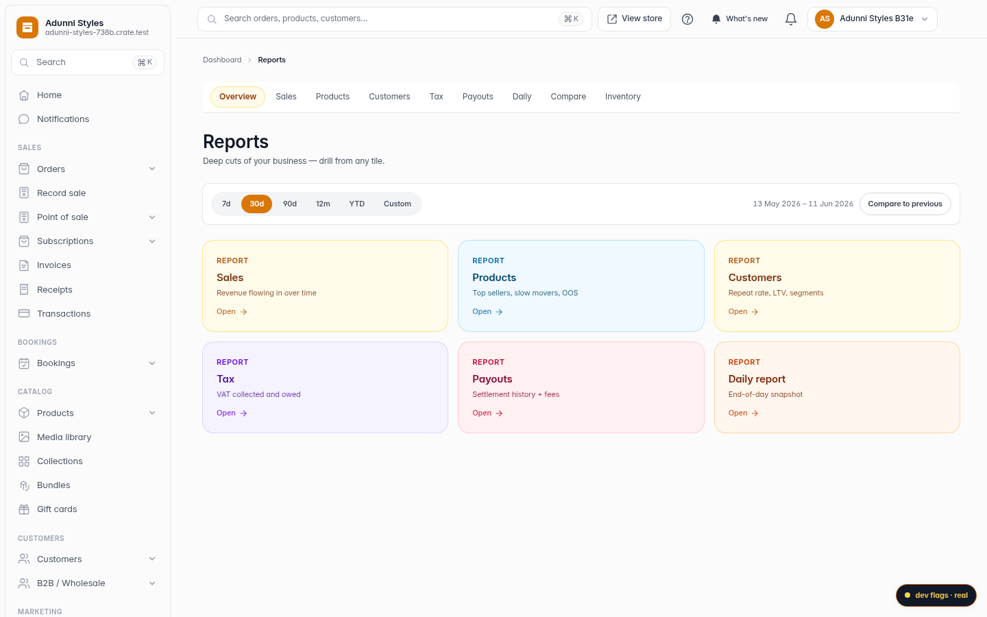
Choose the Sales report
On the Reports overview, click the Sales tile (or Sales in the sub-nav). Crate opens the sales view straight away.
Web -
3
Read your headline numbers
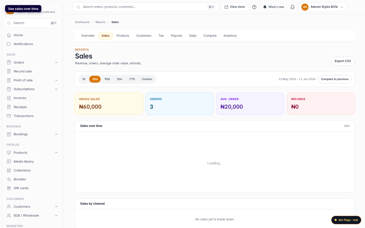
The four tiles at the top are your sales at a glance: Gross sales (total revenue from completed orders), Orders (how many you fulfilled), Avg. order (gross ÷ orders) and Refunds. They update the moment you change the period.
Web -
4
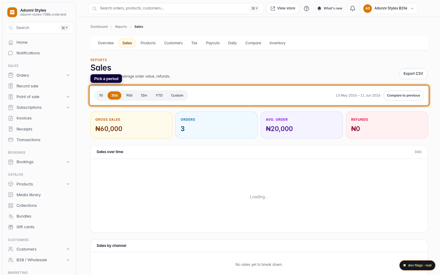
Pick a period
Use the period chips — 7d, 30d, 90d, 12m, YTD or Custom — to set the window you want. The date range next to the chips confirms exactly which days you're looking at.
Web -
5
See sales over time
Below the tiles, the Sales over time chart plots daily revenue across the period so you can spot the spikes and the quiet days at a glance.
Web -
6
Compare with the previous period
Click Compare to previous to pin a second column beside the current one. Crate lays the two periods side by side so you can see whether sales are climbing or slipping.
Web